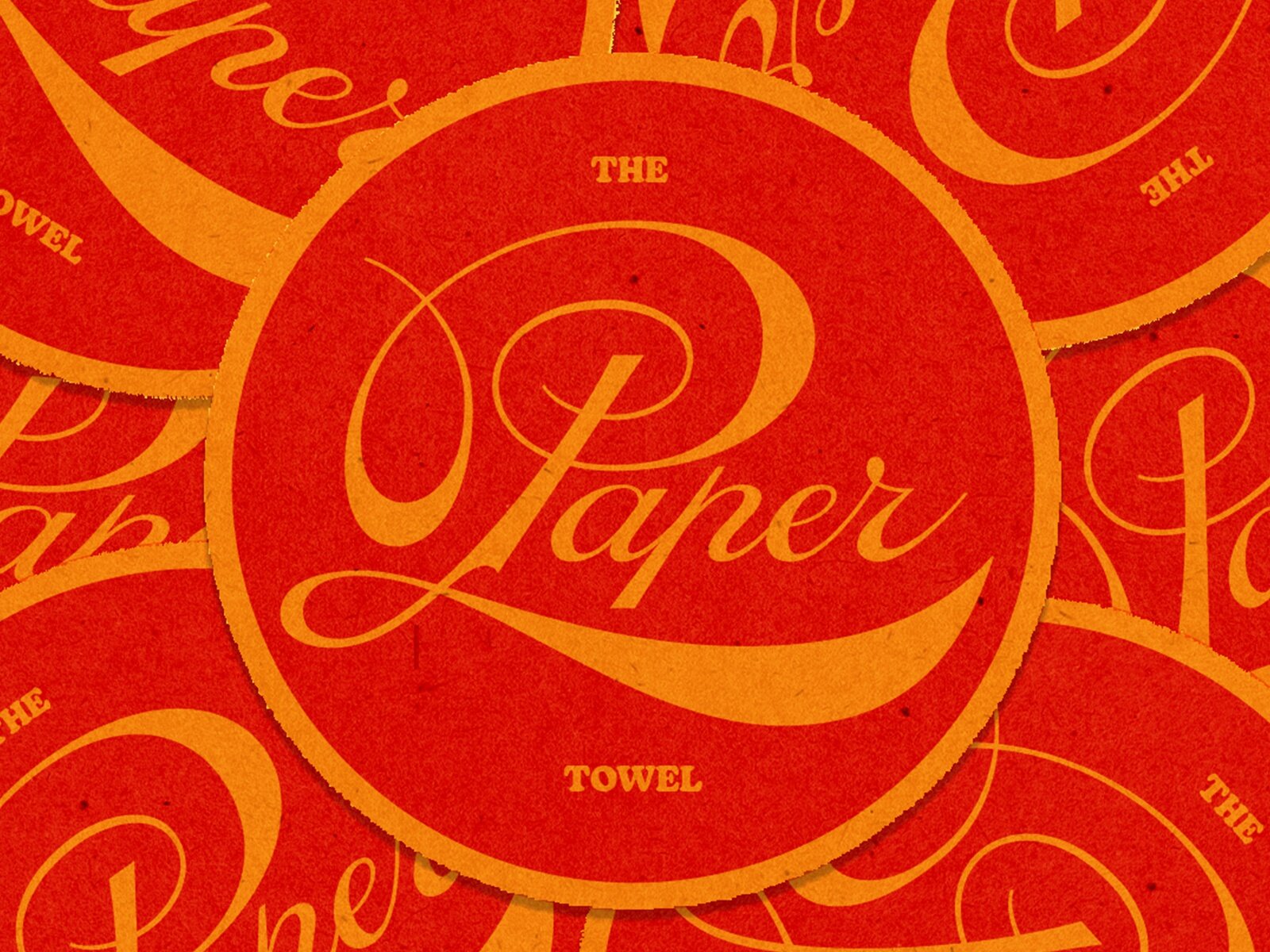
Christopher Caldwell is a multi-talented designer with a passion for type and lettering. Quite fitting then that I’m posting a sample of his amazing work here. This specimen is a self-initiated exercise that he used to keep his restaurant branding game super sharp. (discovered here)
Studio Signs

Nick Lee is the owner of Studio Signs and Pictoral Displays Inc., in Portland, Oregon. Along with this father, Melvin, Nick has been hand-painting signage for several years now, adorning the streets of Portland with one-of-a-kind type design that allows brands to stand out. (discovered here)
Simon and Moose

Simon and Moose is the design studio of Cymone Wilder who (with support of her brother, Cedric) helps define brands through her unique lettering style and captivating design aesthetics. You may also become inspired by looking through her portfolio of photography. (discovered here)
That's Plenty

NYC creative juggernauts &Walsh recently developed a typeface named Plenty Custom as part of a rebrand for a sustainable indoor vertical farming company. Letterforms were designed with leaf-like corners and terminals and avoided straight lines wherever possible to create a very organic and natural feel. (discovered here)
ESPN's Heroic New Type

Buenos Aires-based Superestudio was recently tasked with unifying the ESPN sports brand across multiple international territories, and they did so, in part, by crafting a new custom font called ESPN Pro Loud. The new typeface “…supports the essence of the brand through a unique and individual ‘heroic’ structure.” Game on. (discovered here)